
THE BRIEF
Tom came to me with a vision for a video game race for charity. He had the heart: a desire to turn gaming and community into a "high-speed engine for good." But the organization and presentation needed a little more gas.
He needed to coordinate a pool of racers, track complex scoring across multiple heats, manage a charity prize pool, keep a community engaged on Discord and Twitch, the list goes on. But before all that, he needed a way to communicate and advertise what this was all about.
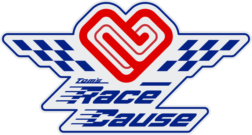
We started with a moniker that emphasizes community with the inclusion of the organizer’s name: Tom’s Race Cause
THE STRATEGY
We wanted to lean into a "Good Neighbor" archetype. Where a lot of video game scenes focus on sweaty competition and individual rank, we were positioning as a friendly community space that was willing to lend a hand.
Our strategy was to wrap everything up in a brand that felt approachable, but established enough for players to engage with and be willing to donate real money for a cause.
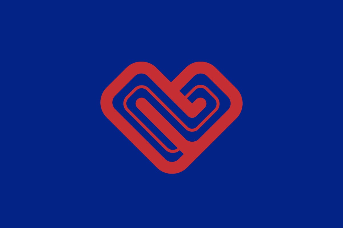
We explored several different racing-inspired styles, ultimately leading ourselves to a symbol that incorporates multiple: a universal symbol of care, a heart, made out of the twists and turns of a contemporary race track circuit.
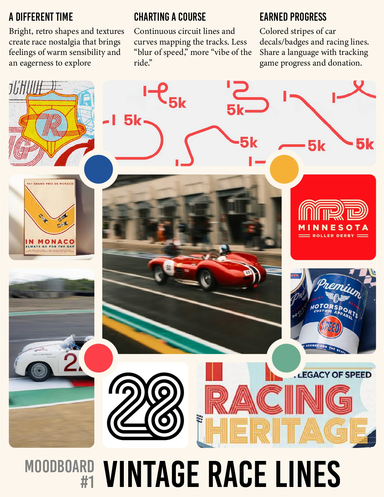
fig. 1: vintage race lines mood board
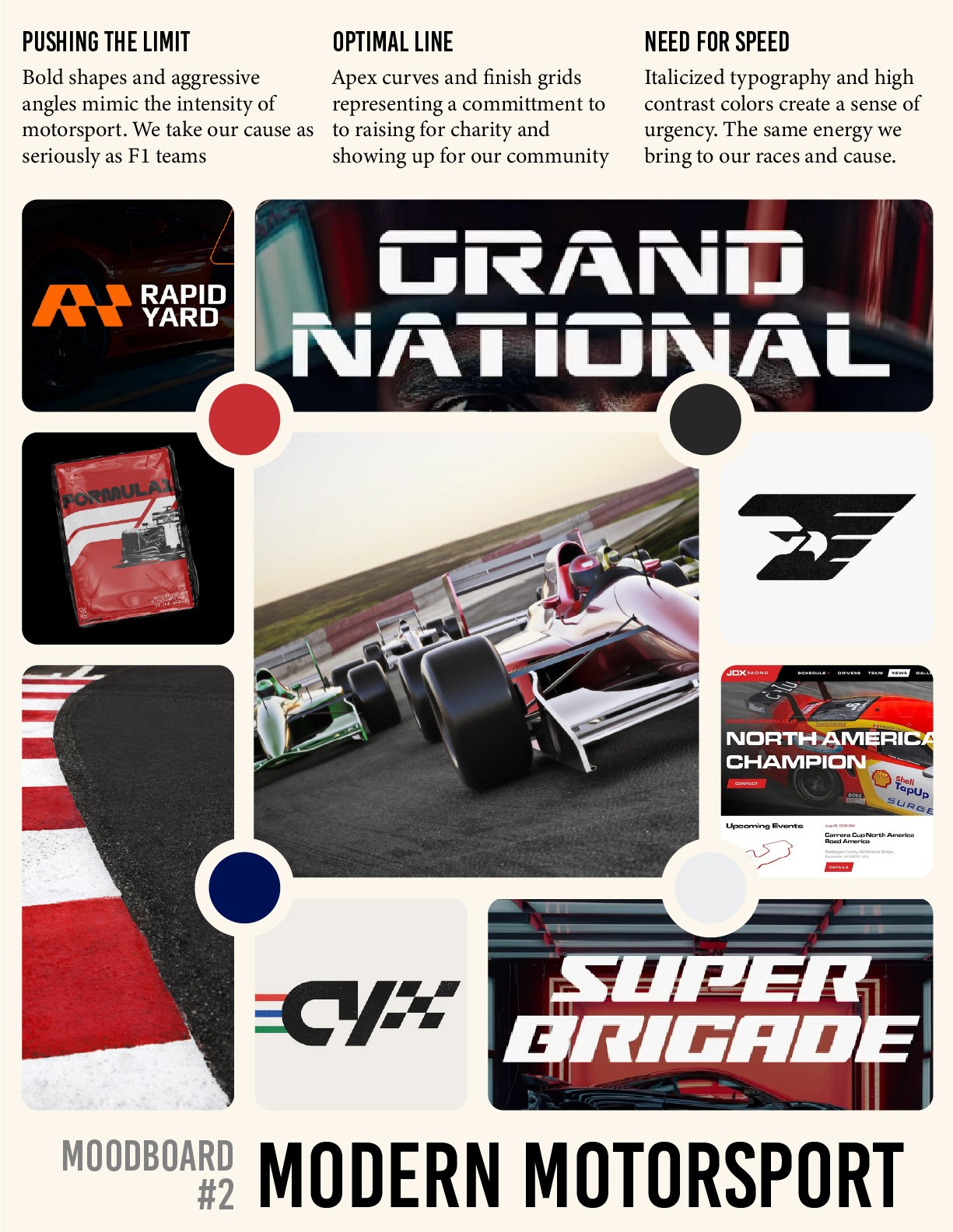
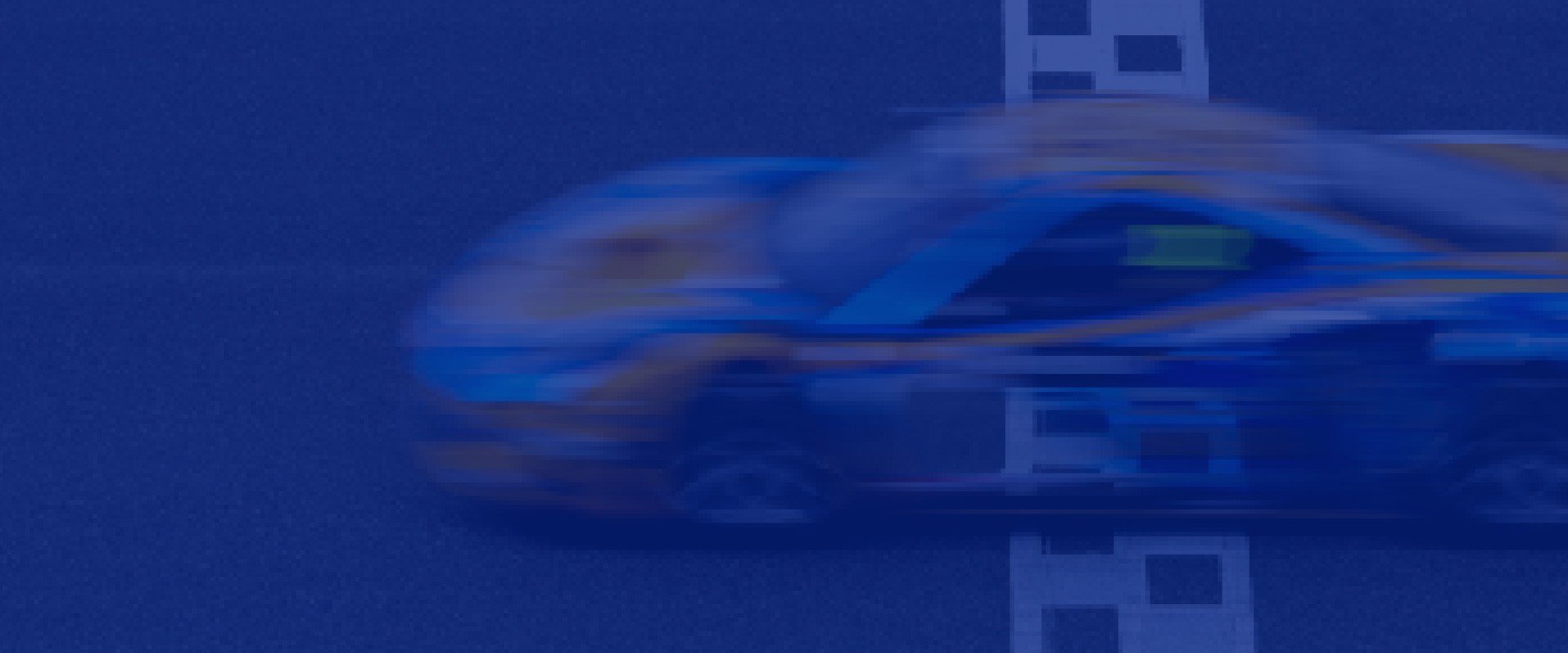
fig. 2: modern motorsport mood board
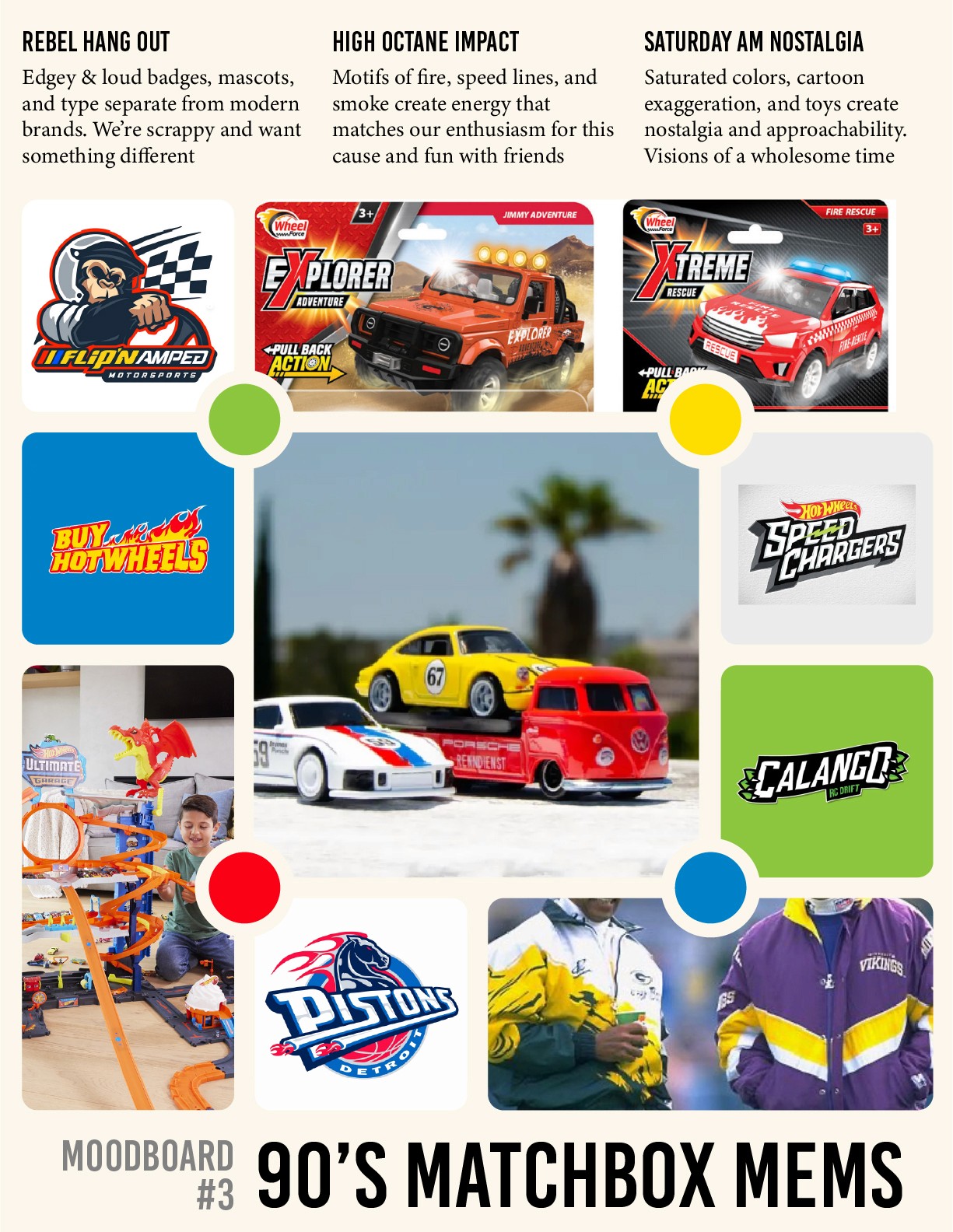
fig. 3: 90s matchbox memories mood board
THE EXECUTION
We agreed that Modern Motorsport was the way, with just a dash of that vintage style if we can.
With our direction in place, I created multiple raw concepts to pursue:
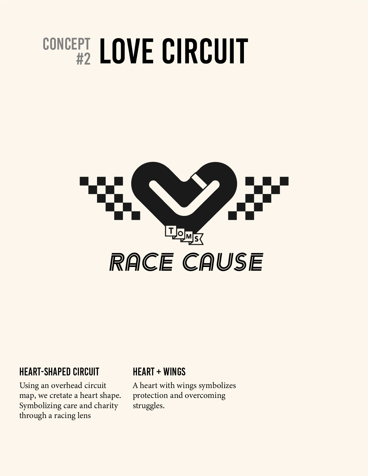
fig. 4: love circuit logo concept
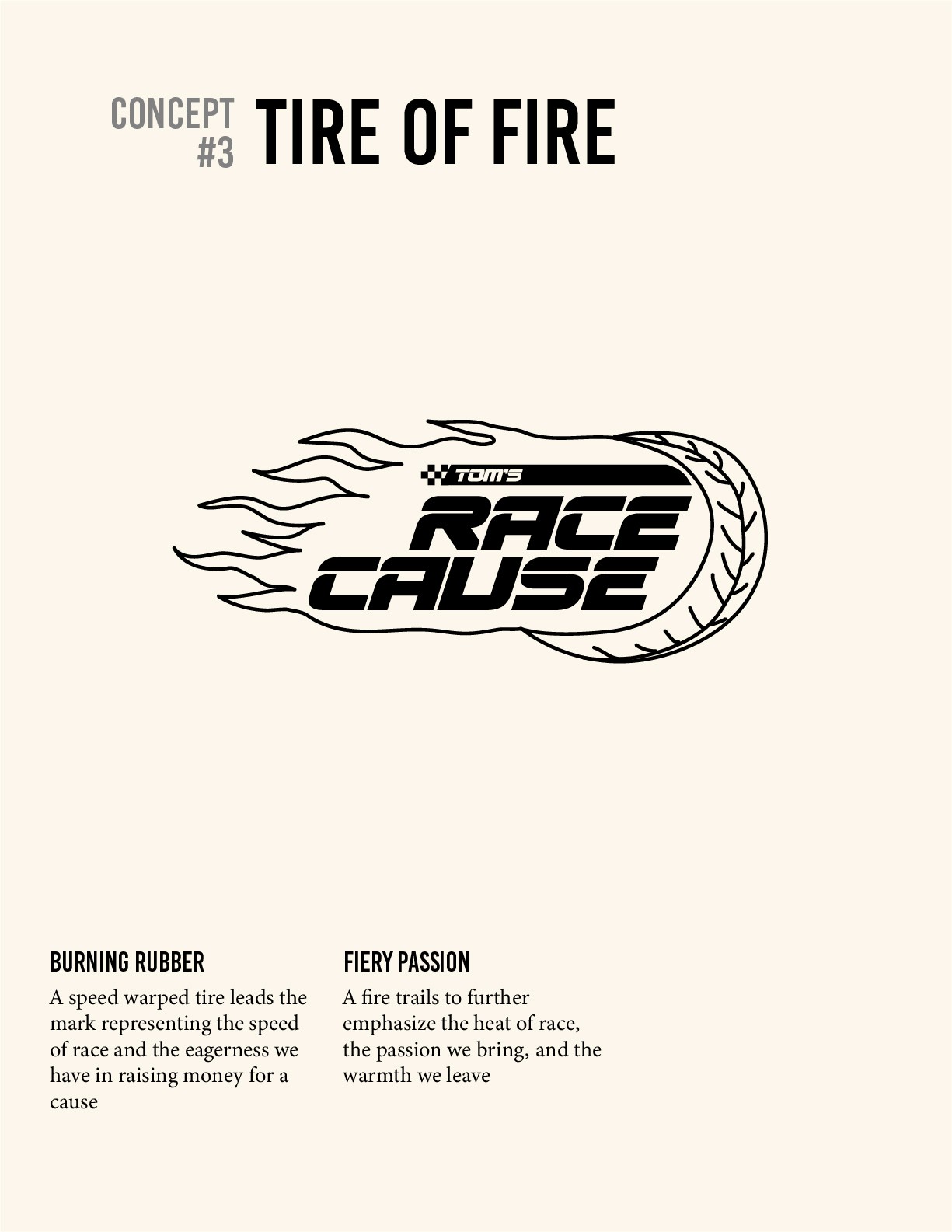
fig. 5: tire of fire logo concept
The motif of the heart-shaped race track felt spot on to us, and we iterated to our final version:
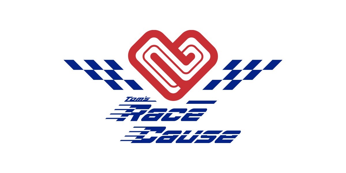
fig. 1: original logo
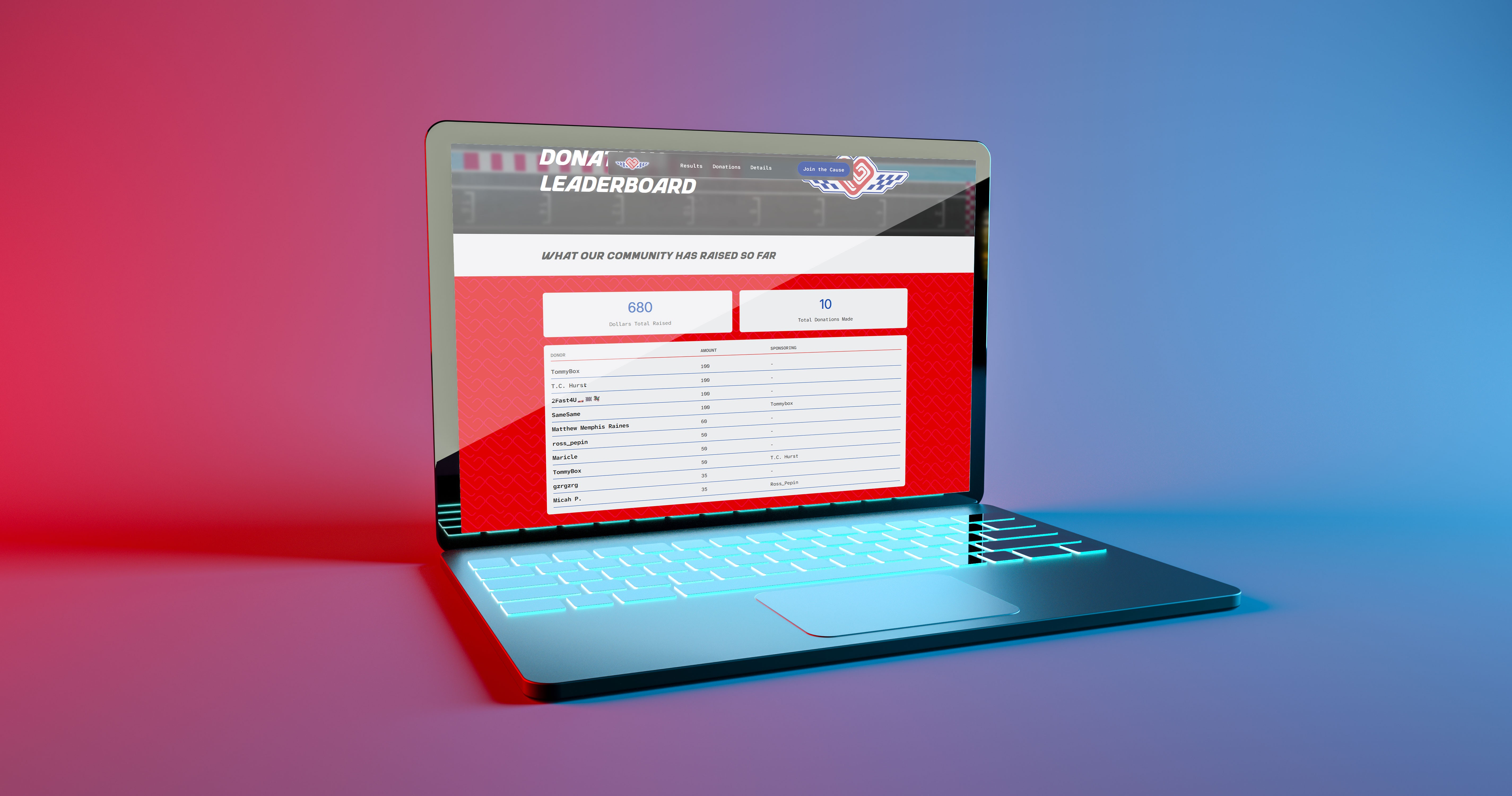
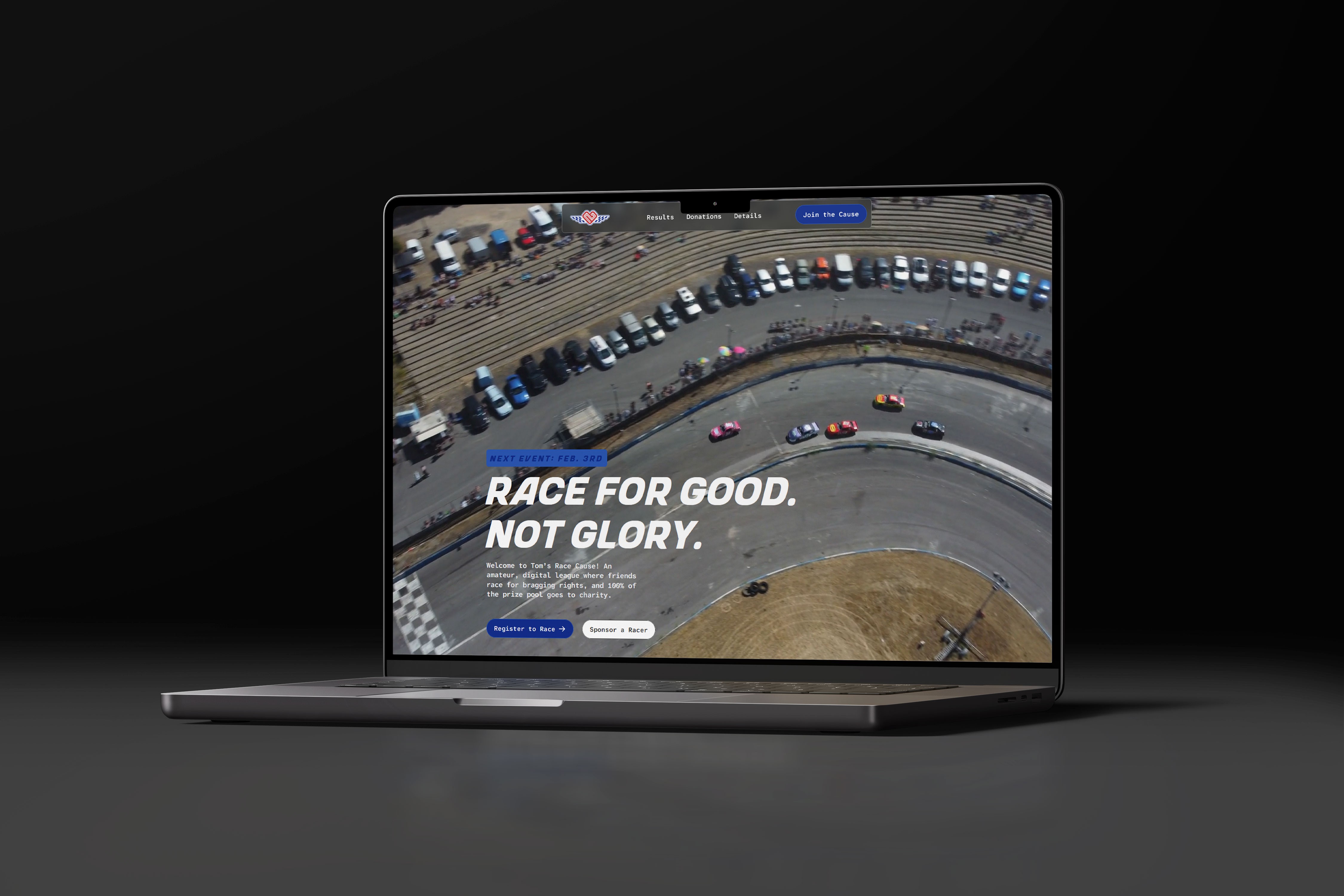
Once all the visuals were created Tom and I got to work on a site to inform collect racer registrants.
THE RESULTS
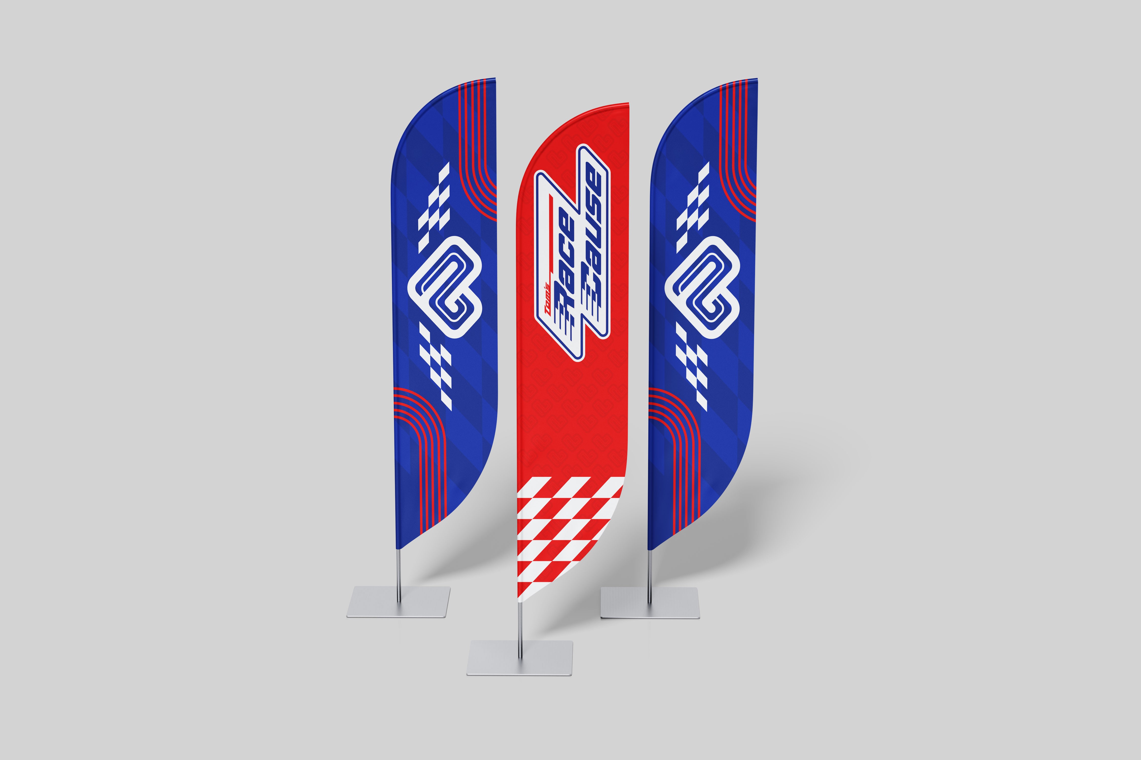
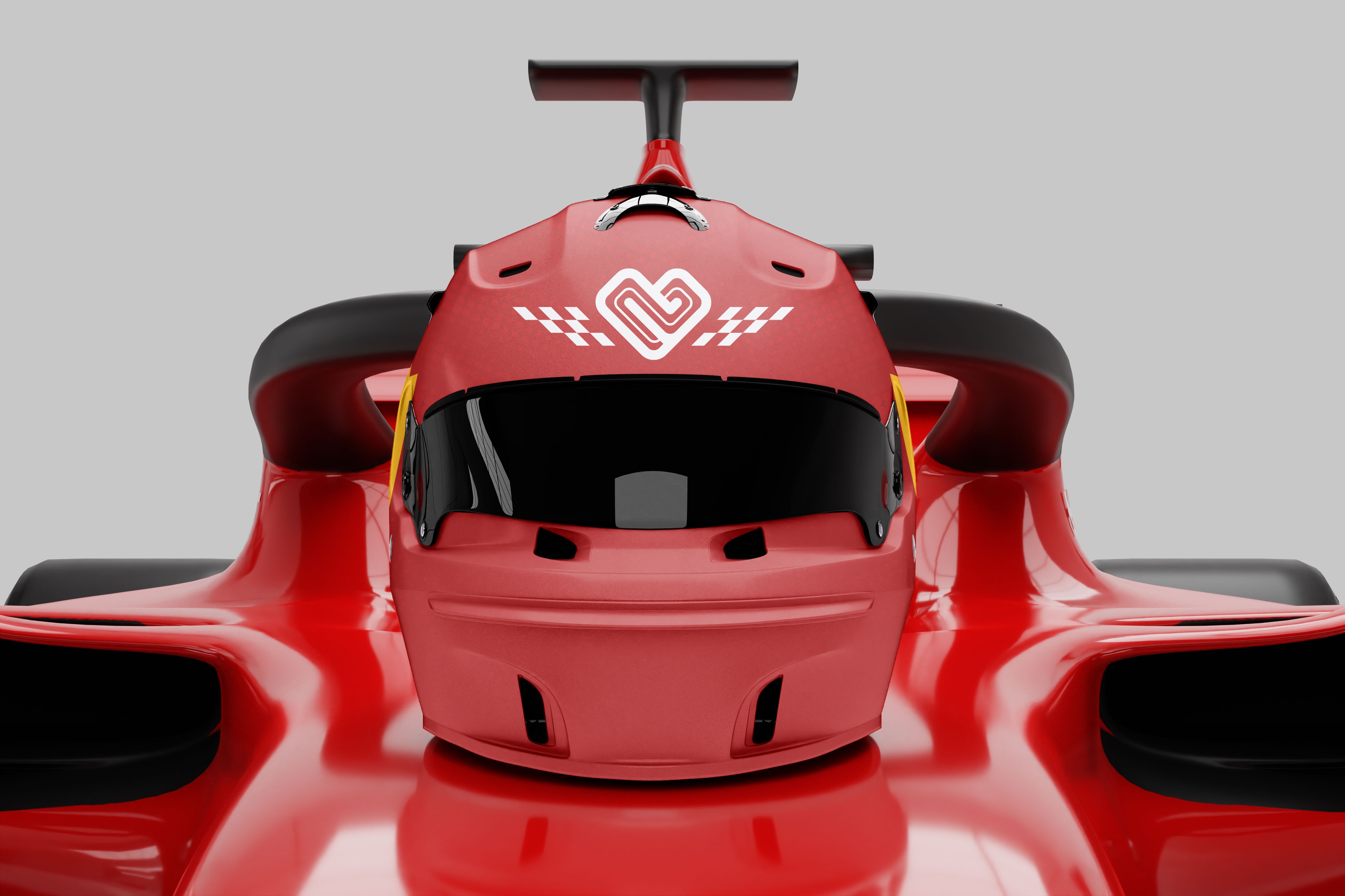
Tom’s Race Cause launched with a full visual identity, messaging messaging platform, and website.
Tom moved from organizer to community leader, with a system he can run for years to come. I think, more importantly, he also earned a sense of pride knowing he built a community space to do real-world good.

"
Holy sh*t! [CEO] and [CTO] really like the logo. They think the pinwheel is genius. They love the colors and that we don't look like everyone else. Everyone likes it. Unreal.
"
- CRO, Pivotly
No tricks, just a clear plan of action to get you where you want to be.
I
CHAT FOR FIT
II
Kickoff & Strategy Discovery
III
Design review & refinement
IV