


THE BRIEF
When I set out to launch T.C. Hurst Design Co., I found myself in the same brand fog a lot of folks face. I knew I wanted to work with genuine and passionate businesses, but the market seemed really crowded.
I needed to create a brand that felt both established and effortless. To prove that a studio of just one could deliver great results without corporate bloat or consultant uncertainty, all while staying true to myself
THE STRATEGY
I applied my own brand strategy process and dove into competitive research. I found 4 archetypes in the market space:
Huge, slow-moving corporate firms
High-volume, generic agencies
Independents without a clear process
Templated outsourced options
I noticed a gap at the cross between quick execution and clear, honest communication. I liked the The Magician as a brand character archetype. It embodies an idea of manifesting identity: taking a vision and translating it into a tangible reality.
I developed mood boards to try and capture my direction. I took major inspiration from our chosen archetype, inspired by the golden age of spiritualists. Think vintage Houdini and Thurston posters mixed with modern type and icons.
Below are the mood boards I put together to help myself find the artistic direction that matched this strategy:

fig. 1: Atmospheric Mystique Mood Board

fig. 2: Playful Paradox Mood Board
THE EXECUTION
I loved the sense of mysticism that came with the first mood board. It also emphasized ideas of fortune and visions that seemed appropriate. I began sketch explorations to hone the symbol concepts
I experimented with a view ideas that had promise, but kept coming back to the same concept early: something around a crystal ball and eye.

fig. 3: sketches closing in on mark

fig. 4: sketching business card concept
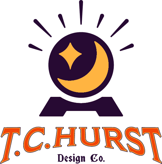
At this point I knew I wanted the logo to center around a crystal ball to replicate a mystical discovery. I took that primary motif, and iterated. The crystal ball's details doubled as glass glare and as a star and moon. When looking closer, the combination reveals itself as a "seeing eye." These are symbols of clarity and vision emerging from the unknown.

fig. 5: crystal ball vector iteration

fig. 6: final logo vector concepts
The execution included building a cohesive playbook that suggests how the brand speaks, moves, and acts.
I then used this playbook as the guide to design a full website and marketing collateral to promote myself.
THE RESULTS
The result is the brand you are interacting with right now. By following the full process, I moved from a blank page to a fully launched, market-ready identity in just a handful of weeks.
The brand now serves as an engine for my own business.
I’ve given myself the confidence to make promises to my clients. I don't just send files, I deliver a complete kit to ensure that every brand is as impactful as its initial vision.
Deliverables:


"
Holy sh*t! [CEO] and [CTO] really like the logo. They think the pinwheel is genius. They love the colors and that we don't look like everyone else. Everyone likes it. Unreal.
"
- CRO, Pivotly
No tricks, just a clear plan of action to get you where you want to be.
I
CHAT FOR FIT
II
Kickoff & Strategy Discovery
III
Design review & refinement
IV